+ Notes provisoires de video {ICI}. 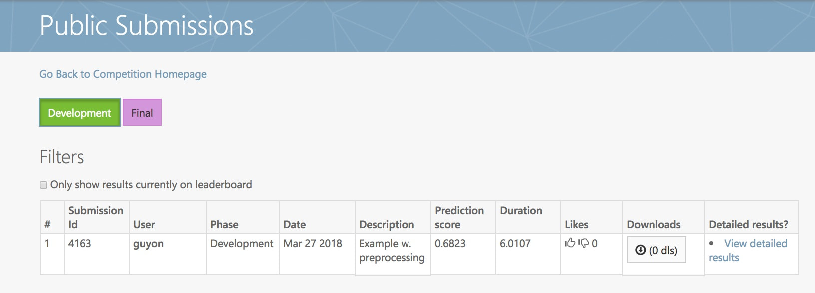 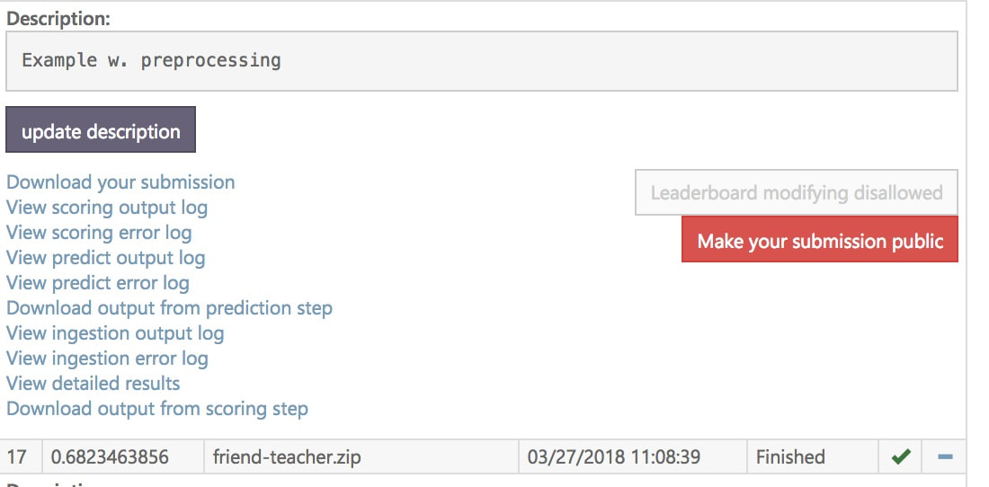 Le rapport écrit ne devra pas excéder 6 pages + 1 page de bibliographie. Le rapport devra inclure en entête :
L’exigence absolue est que le code fonctionne. Pour la version finale, il n’y aura pas de points au rapport si le code ne fonctionne pas (c’est à dire si l’exécution du Jupyter notebook par les assistants ou le professeur flanche ou le code soumis sur Codalab ne fournit pas les résultats indiqués dans le rapport). Il n’y aura aussi pas de points au rapport si un des membres de l’équipe est convaincu de plagiaire. Notez que cette politique s’applique à toute l’équipe : pas de points au rapport de l’équipe si une seule des classes Python fournies ne marche pas ou un seul morceau de code est copié : entraidez-vous ! En dehors de ces exigences absolues, le travail sera évalué selon les critères suivants: Originalité (10 points) : L’approche, l’analyse et/ou les algorithmes proposés contiennent des idées originales émanent du groupe. Qualité scientifique et technique (10 points) : Les algorithmes sont implémentés de manière claire et efficace. Les explications fournies dans le texte sont bonnes. Présentation (10 points) : Le rapport est écrit clairement, bien présenté avec des figures et des graphes et une bibliographie. TIPSWhat can I put in my report?
We will provide a sample report when time comes. A few general suggestions: Structure: Adopt a simple standard structure, for instance: Abstract Background Material and methods Results Conclusions Exploratory analysis: show the “marginal” distribution of the target value. multiclass/multilabel: represent the matrix of correlation of class labels or target valus as a heat map. univariate distributions: for each variable, plot the histogram of labels/target values. multiclass/multilabel: show the scatter plots of all pairs of features and the histograms on the diagonal. multiclass/multilabel: perform PCA or t-sne and project the data in 2 dimensions. Show a scatter plot and color code the labels of the classes. univariate analysis: show a bar gray with the value of the chose metric using each feature as the classification prediction (oriented properly) or build a linear predictor with just one feature and show its prediction accuracy (OK to do this on training data as exploratory analysis). large matrices: represent the data matrix as a heat map, preferably after 2-way hierarchical clustering. images: do PCA and show the first few principal components. Learning curves: show performance as a function of the number of training examples. show 3 curves: training, validation, and test. show error bars (see result reporting below). for iterative algorithm (e.g. gradient descent) show performance as a function of the number of iterations. for ensemble algorithms such as tree classifiers: show performance as a function of the number of weak learners (e.g. individual trees). Model selection/hyper-parameter selection: try autosklearn https://automl.github.io/auto-sklearn/stable/ First identify which parameters are most sensitive with a coarse grid-search Identify one or two that are really critical and vary them more finely plot performance as a function of the hyper-parameter (HP) for training, validation, and test set if you vary 2 HPs on a grid, represent the results with some color code or gray level on a 2-d grid to visualize them. Feature selection: plot performance in AUC and BER as a function of the number of features for several methods. Show performance error bars or confidence intervals. add “probes” that are additional features that are random permutations of the original features; compute the fraction of probes that are selected as a function of the number of selected features. L1 selection: show a lasso path using LARS. images: show pixel importance. Class imbalance: plot ROC and/or precision-recall curves optimize the threshold on the discriminant value by cross-validation Result reporting: show results on training, validation, and test data show error bars, obtained e.g. by re-sampling (The bootstrap method consists in resampling with replacement. You draw many test sets with the same size by sampling them from the original test set, with replacement. You compute the standard deviation of the scores on the various test sets obtained: this gives you an error bar). show scatter plots of predicted values vs. measured values and indicate the diagonal; interpret them in terms of bias and variance. confusion matrix: represent but as a table and as a heat map. vary the methods: show the results of random guessing show the results of classical methods (Naive Bayes, linear regression/classification, kernel method, nearest neighbors, RF) + indicate the hyper-parameter setting for reproducibility try to propose something new/original to improve performance (a preprocessing, a new way to do ensembling, etc.)
0 Comments
Notes provisoires 2eme soumission: {ICI}. Re-soumettre le code sur Codalab avant Dimanche 25 Mars pour ameliorer la note (ce sera votre DERNIERE soumission de code qui comptera). Le code soumis doit inclure les tests (c'est le zip soumis qui compte, pas la version sur Github). Seules les classes preprocessing et model sont notees. Le modele doit appeler le preprocessing.
But = Finaliser de la première version du code à soumettre sur Codalab.
|
AuthorIsabelle Guyon. Chaired professor of "big data", Paris-Saclay University. President of ChaLearn.org. Archives
April 2018
Categories |

 RSS Feed
